
[GUIDE] 6-Figure Webinar Landing Page
My formula + AI prompt for 70% opt-in rates

Last year, we generated multiple six-figures in revenue using webinars.
And after running dozens of webinar experiments, we found a landing page formula that consistently hits 60-70% opt-in rates.
So today, I want to walk you through:
My 6-Figure Webinar Landing Page Copywriting Formula — The exact landing page structure we use on every webinar.
3 Webinar CRO Tips — A handful of proven tactics that can push your opt-in (and overall conversion) rates even higher.
A Real-World Example — A full breakdown of one of our highest-converting landing pages (70%+ opt-in rate) so you can see the framework in action.
My Webinar Landing Page AI Mega Prompt — A plug-and-play prompt trained on this framework (to help you draft your own webinar landing pages in minutes instead of hours).
Lastly, I’lm also including a downloadable “Skill” version of this prompt so you can literally install this framework into your Claude workspace once - and then use it over and over again.
Let’s get into it.
My 3-Part Webinar Landing Page Formula
After testing a few different layouts, we’ve found that the most effective landing pages tend to also be the simplest.
So these are the 3 sections we always include:
Section #1 — The Hero
This is where you stop the scroll.
You’ve got about 3 seconds to convince the reader that this webinar is worth their time.
So the goal of this section is to communicate 3 things as fast as possible:
What the webinar is about
What they’re going to walk away with
Why they should care
Here are the different copy components we use to accomplish that:
Pre-headline: Calls out your audience, creates curiosity, or frames the event format (e.g., “FREE Ghostwriting Workshop”)
Headline: Leads with the benefit or transformation they’ll get
Whisper: A parenthetical that handles objections or creates FOMO
Sub-headline: Explains what they’ll walk away with
Social proof elements: Date/time, duration, previous registrant count — builds credibility and reduces friction
CTA button + countdown timer: Creates urgency and gives them a clear next step
Section #2 — The Overview
This is the first section below the fold.
The goal here is to sell the “what” - what are people actually going to learn or walk away with from this webinar?
But you don’t need 47 bullet points to accomplish that.
You just need to share 3 things (e.g. frameworks, strategies, key takeaways, etc.) that give the reader an accurate overview of what they can expect to learn.
The key, though, is to frame each of these bullets in a way that feels compelling and enticing.
So with that in mind, this is the way we normally structure our overview bullets:
{Framework Name}: {Description connecting the topic to a tangible outcome. Bold the most compelling phrase.}
That’s it.
They create a curiosity gap. They’re scannable. And they’re benefit-driven.
This section can also mention:
Additional details about the format and duration of the webinar itself
A special bonus to incentivize registrations or live attendance (or both). We’ll cover this more in the CRO Tips section.
Section #3 — Instructor Credibility
This is where you answer the question:
“Why should I listen to you?”
Here’s what you should include here:
Bolded quantifiable credentials — for example: revenue generated, students taught, years of experience, companies worked with, etc.
Photo(s) — this shows you’re a real person & helps build trust and affinity before the webinar has even begun.
Final CTA button — one more chance to convert before they leave
Remember:
The goal of this section isn’t to share your whole life story.
But to give people just enough proof to trust you know what you’re talking about.
A couple more pro tips:
Lead with your most impressive or relevant credential
Use numbers whenever possible (not “helped many people” but “helped 1,400+ people”)
Keep it to 2-4 sentences max - if they’ve scrolled this far, they’re already interested
Now let’s see how all 3 sections come together on a real page.
Example Breakdown
As we headed into 2026, we wanted to run a timely webinar (rather than our usual pillar presentation).
So we put together a goal-setting workshop for both experienced & aspiring ghostwriters.
These were the results:
70%+ opt-in rate
3,000+ registrations
And 100+ discovery calls booked
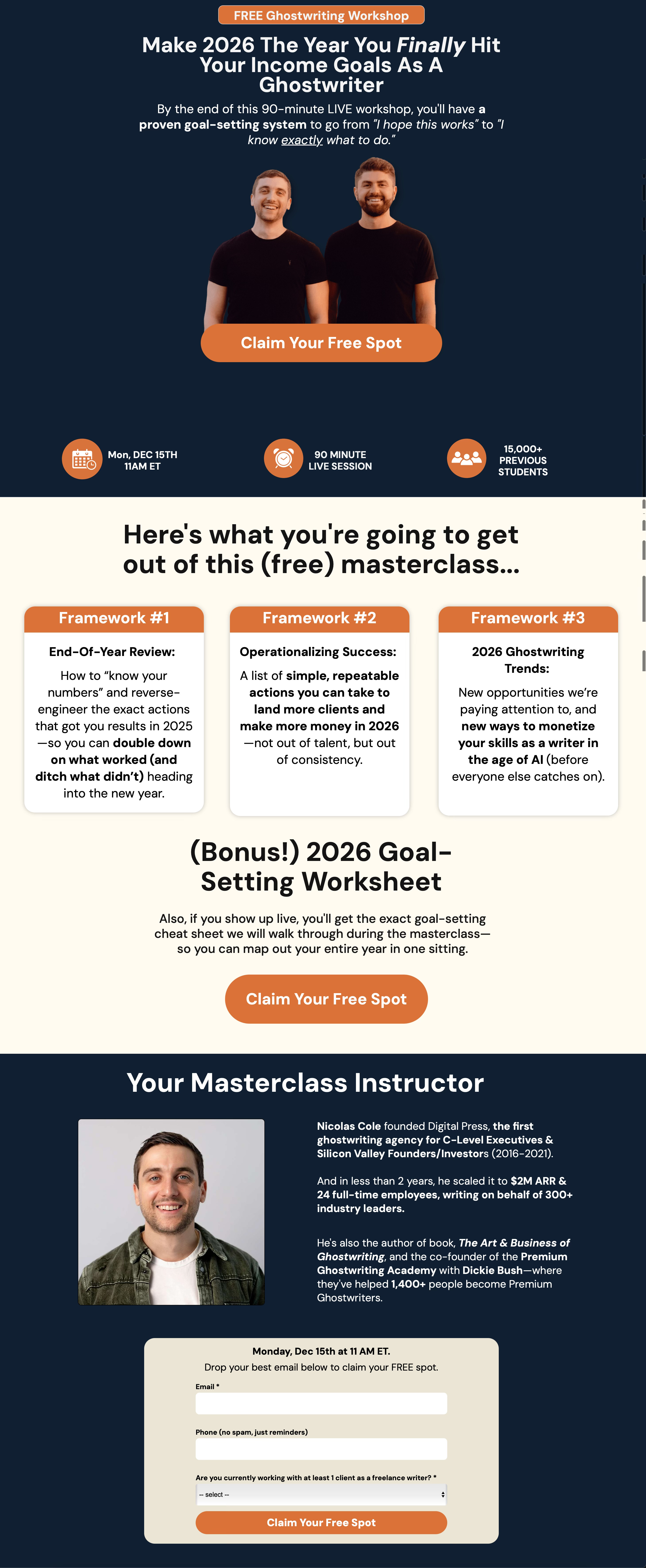
Here’s a full screenshot of the landing page:
Let’s break down why each of the different pieces worked so well:
The Hero Section
Pre-headline: “FREE Ghostwriting Workshop” — immediately frames the event and removes the price objection
Headline: Benefit-focused, future-paced (“Make 2026 the year you finally…”)
The word “finally” — implies they’ve been struggling, creates emotional resonance
Sub-headline: Explains exactly what they’ll walk away with (“a proven goal-setting system”)
Contrast: “I hope this works” → “I know exactly what to do” — feels like a tangible transformation
The Overview Section
“Here’s what you’re going to get out of this (free) masterclass…” — simple, clear, benefit-focused header
3 Frameworks, not 10 — keeps the copy scannable
Each framework has a name/title + tangible outcome — “End-Of-Year Review,” “Operationalizing Success,” “2026 Ghostwriting Trends”
Bold phrases make it dead easy for the reader to pay attention to the most important parts of the copy — “double down on what worked (and ditch what didn’t),” “simple, repeatable actions,” “new ways to monetize your skills”
Bonus creates urgency to register AND attend — “if you show up live, you’ll get…” incentivizes attendance, not just registration
CTA — another chance to convert before they scroll further
The Credibility Section:
Quantifiable credentials in bold — “$2M ARR,” “24 full-time employees,” “300+ industry leaders,” “1,400+ people”
Relevant proof only — Digital Press, the book, PGA. Not his full life story.
Photo builds trust — he’s a real person!
Final CTA + form — captures the conversion right there
Now, that’s the core framework.
But there are a few additional tweaks that can push your conversion rate even higher - which we’ll cover next.
3 CRO Tips To Help You Maximize Your Opt-In (And Overall Conversion) Rates
Our 3-part framework is the foundation.
But here are a few additional tactics we’ve used to squeeze even more conversions out of our webinars:
Tip #1: A/B test different headlines
More often than not, the first headline you try won’t be the best one.
And the only way to find out if you’re sitting on a winner is to A/B test.
We typically test 2-3 headline variations for all our webinar landing pages. Each variation uses a different psychological angle - curiosity, pain, benefit, us vs. them.
Then, we let the data tell us which one resonates most.
Tip #2: Incentivize both registration and live attendance
You can offer bonuses for registering, bonuses for showing up live, or both.
So if you have the bandwidth, we recommend doing both.
Why?
Because you don’t want people to just register - you also want them to show up.
A registration bonus (like a free resource) can increase the chances people sign up.
And a live attendance bonus (like a worksheet or exclusive Q&A) gives them a reason to block their calendar and be there in real time.
Example: On our goal-setting webinar, we offered a “2026 Goal-Setting Worksheet” that we’d walk through live.
Tip #3: Use your Thank You page to pitch the next step
Here’s a big lesson we learned this year:
People are more likely to take action right after they’ve already taken an action.
This is why we always include a CTA on our Thank You pages.
For example, after someone registers for one of our webinars, we have a soft pitch to apply to join PGA.
And as a result, we usually book dozens of calls before the webinar even begins.
So yes, it works!
My 6-Figure Webinar Landing Page AI Prompt
Below you can find an AI Mega Prompt trained on the exact framework I just walked you through.
Just start a conversation with your go-to AI tool (I like using Claude) and let it interview you for context before it starts working on your landing page copy.
One quick heads up:
This prompt is designed to brainstorm 5 different hero section variations for you. That way, you have a few different options to choose from (or even AB test if you want to find out which angle resonates most with your audience).
