

The first step to building a million-dollar newsletter:
Nailing your newsletter landing page.
Why?
Simple - the better your landing page is, the faster you’ll be able to grow your email list with both engaged readers and potential customers.
But let me show you what I mean with a quick tangible example.
Say you drive 1,000 visitors to your newsletter landing page each month.
If your landing page has a 20% opt-in rate (meaning 20% of visitors end up subscribing) that means you’ll get 200 new subscribers per month out of those 1,000 visitors.
But if your landing page has a 40% opt-in rate, you’d suddenly get 400 of those 1,000 visitors to become subscribers.
That’s 2x more email subscribers with the exact same amount of monthly traffic.
Read that again.
So now, the question is:
How do you maximize your landing page opt-in rates?
Well, over the past few years I’ve built hundreds of newsletter & lead magnet landing pages, many of which have had a 40%, 50%, and even a 60%+ opt-in rate.
And along the way I’ve developed 7 rules I follow every single time I sit down to write and build a new landing page.
So let me walk you through them (using my own newsletter landing page as an example):
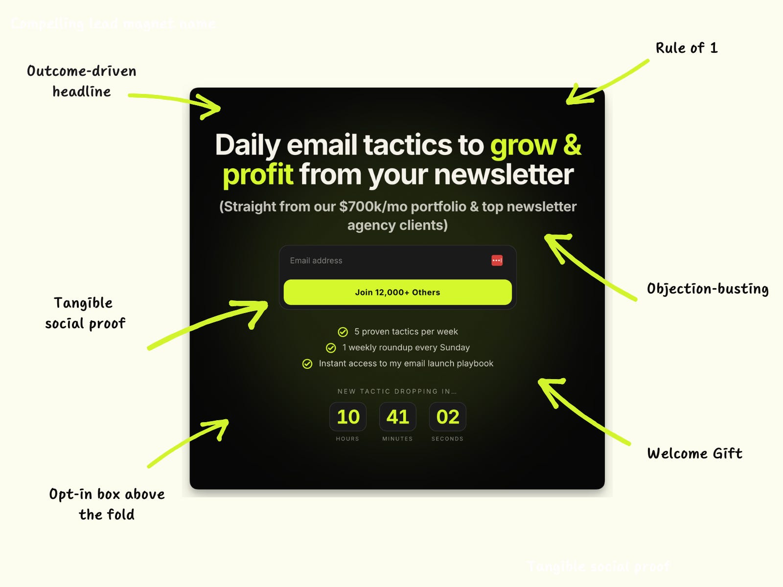
Rule #1: Clear And Compelling Headline
You’ve probably heard the famous Ogilvy quote before:
“On the average, five times as many people read the headline as read the body copy. When you have written your headline, you have spent eighty cents out of your dollar.”
Now, even though he said that decades ago (and in the context of paid advertising), this is still true.
And it also applies to your newsletter landing page.
Now, how do you write a great landing page headline?
There are dozens of small nuances - but none of them matter if your headline doesn’t promise a tangible & compelling outcome (or transformation).
Because ultimately that’s what people want: an outcome, a result, or a transformation.
Rule #2: Objection Handling
Now, sometimes making a good promise isn’t enough.
People have doubts.
They read your headline, they like the outcome, and then their brain immediately fires back with some version of “yeah, but that won’t work for me.”
So if you want to maximize your opt-in rates, make sure to always include an objection busting sentence at the end (or underneath) of your headline.
On my page, that’s the line sitting right below my headline:
“(Straight from our $700k/mo portfolio & top newsletter agency clients).”
This simple line addresses two objections at once:
Why should I listen to you?
How do I know this actually works?
Pro tip: use a smaller font size and italicize your objection busting sentence so your main headline doesn’t get too bulky.
Rule #3: Clear And Compelling Name
One of your main goals with a page like this is to make what you’re offering feel tangible.
You want it to feel like a real thing. Ideally, like a product.
And one of the easiest ways to do that is to name it.
Give your newsletter (or lead magnet) an actual name that makes it clear for people what’s in for them.
Typically, I like to have the name of my newsletter or lead magnet as the “eyebrow” copy above my headline - but for my Daily Email Tactics landing page, I was actually able to bake it into the headline itself.
Rule #4: The Rule Of 1
There’s only ONE thing you can do on my landing pages:
Opt in or bounce.
There’s no navigation bar, no blog archive, no social media buttons.
NADA.
And that’s intentional. Because all those fancy buttons and links people like adding to their landing pages are nothing but distractions.
And guess what - distractions = lower opt-in rates.
This is one of the easiest rules to implement in this whole list - and yet almost nobody does it.
Rule #5: CTA Above The Fold
Speaking of CTAs.
You want to make it as easy as humanly possible for people to take the action you want them to take (which is opting in and subscribing).
And “easy” means NO scrolling.
That’s why your opt-in box should always be above the fold.
In case you’re not familiar, the above the fold section of your landing page is everything people can see upon loading the page and before they have to scroll down.
Now, here’s a pro tip (most people get this wrong, too): Check the mobile version of your landing page to make sure the opt-in box is above the fold there too.
Your opt-in form should be completely visible without having to do any scrolling - both on desktop AND on mobile.
Rule #6: Tangible Social Proof
As we all know, social proof is extremely powerful.
But here’s the thing: If you want to keep everything (at least all the important pieces) above the fold, that often means you have very limited real estate to work with.
So instead of dropping in a long quote testimonial, one of my favorite moves is to add a short blurb with tangible social proof.
On my page, it’s built into the button itself: “Join 12,000+ Others.” It costs zero extra space, and it gives people a hard number instead of a vague claim about how great the newsletter is.
Rule #7: Welcome Gift
Alright, last rule.
But this is one of the most powerful and underrated tactics from the list.
First, even though your newsletter is free, you want to think about it as an offer.
Most newsletter offers are some version of “give me your email and I’ll send you weekly tips about [topic],” which asks the reader to wait days, sometimes weeks, before they get any value.
A Welcome Gift fixes that. It’s a lead magnet new subscribers get access to the second they join, so they know exactly what they signed up for and get rewarded immediately (instead of three days or three weeks from now).
3 things to keep in mind: call it out on your landing page (instead of making it a surprise), keep it congruent with what your newsletter actually covers, and make sure it solves a painfully specific problem.
On my page, I speak to it in the third bullet under the CTA button: instant access to my email launch playbook.
Remember: people want value now, not next week.
(Bonus) Rule #8: A Compelling Mockup Image Or Screenshot
Back in rule #3 we talked about making your offer feel tangible by naming it.
A mockup image does the same job, except visually.
That’s why most of my landing pages have a high-quality mockup image on them.
Note: I don’t have this on my current Daily Email Tactics landing because this usually makes more sense to do for a lead magnet instead of a newsletter. (It’s harder to “visualize” a newsletter as a physical asset, but you can definitely get creative with it!)
Wrapping Up
None of these 7 rules are complicated.
You could go through your own landing page right now and check off all 7 in about 20 minutes.
But that’s kind of the point.
Remember the math from the top of this piece: going from a 20% opt-in rate to a 40% opt-in rate doubles your list growth without a single extra visitor.
Which makes this exercise the highest leverage 20 minutes you’ll spend on your newsletter this week.
Anyway, hope this was helpful!
And if it was, please:
Leave a comment letting me know which rule you’re going to fix first
Share this with a friend or colleague who could find it helpful as well
Until next week,
Daniel
PS - Enjoyed this piece? Then you’re going to love my newsletter, Daily Email Tactics.
Every day, I send a hyper short (and hyper actionable) email breaking down a tactic to help you grow or monetize your email list.