
5 landing pages worth stealing from
(Plus 2 AI prompts to write yours)

I‘ve been collecting lead magnet landing pages for a while now.
Every time I see one that makes me want to opt in - even when I don’t need what they’re offering - I screenshot it and save it my swipe file.
Recently I went through my collection and pulled out 5 of my favorites from all time.
And today, I want to share them with you.
For each landing page, I’ll include:
A screenshot of the landing page
What I like about it (and why it works)
What type of lead magnet it is (newsletter, email course, etc.)
Let’s get into it.
Landing Page #1: The Ad Professor
Type: Newsletter
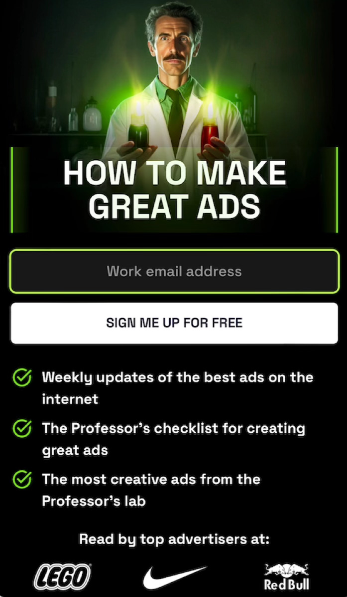
What I Like About This Page:
Highly memorable design - The “professor” character and lab aesthetic make this impossible to forget. Most landing pages blur together. This one sticks out big time.
Clear & compelling value prop (with a twist of humor) — “How to Make Great Ads” is straightforward. But the professor persona adds personality without sacrificing clarity.
Visual social proof — The logos at the bottom (LEGO, Nike, Red Bull) say “real advertisers read this” without needing a big paragraph of text.
Landing Page #2: Kate Bourgoin
Type: Newsletter
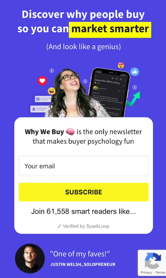
What I Like About This Page:
Positions itself as the “only” - “The only newsletter that makes buyer psychology fun.” She’s not trying to be better than other newsletters. She’s claiming a category of one.
Taps into your ego — “(And look like a genius)” is a brilliant subheadline. Not only are you going to learn something, but these insights will change how your peers perceive you.
Big name social proof — Justin Welsh’s photo and quote at the bottom. One recognizable is much stronger than a wall of testimonials from people who you don’t know.
Landing Page #3: Harry Dry
Type: Newsletter
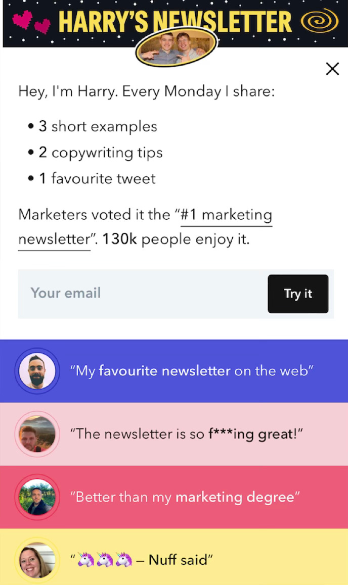
What I Like About This Page:
Feels personal & human - “Hey, I’m Harry” makes it feel like a friend inviting you in, not a brand selling you on something.
Clear, concise, & tangible value prop - “3 short examples, 2 copywriting tips, 1 favourite tweet.” You know exactly what you’re getting before opting-in.
Makes it clear who it’s for - “Marketers voted it the #1 marketing newsletter.” If you’re a marketer, you immediately know this is for you.
Landing Page #4: Greg Isenberg
Type: Email Course
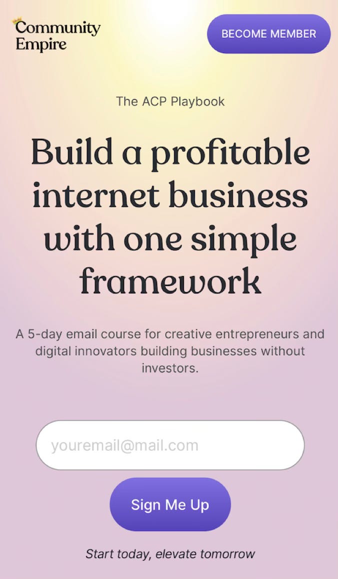
What I Like About This Page:
Clean & beautiful design - The gradient background and minimal layout feel premium. The design builds trust before you even read the copy.
Clear & compelling value prop headline - “Build a profitable internet business with one simple framework.” Clear promise in just one sentence.
Feels like a product - The email course has a name (”The ACP Playbook”). Naming your lead magnet makes it feel more valuable than just another “free email series.”
Landing Page #5: The LinkedIn Creator
Type: Newsletter
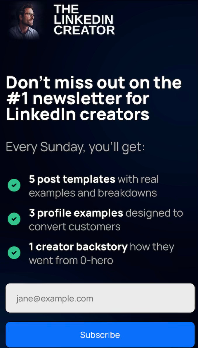
What I Like About This Page:
Super specific deliverables — “5 post templates, 3 profile examples, 1 creator backstory.” Hyper clear and tangible promise.
Sets clear expectations - “Every Sunday, you’ll get...” tells me exactly when it arrives and what to expect, which reduces uncertainty.
Headline creates FOMO - “Don’t miss out on the #1 newsletter for LinkedIn creators.” Nobody wants to be out of the loop.
Now, as usual, I’ve got some AI prompts to help you craft your own lead magnet or newsletter landing page copy.
Prompt #1: Write Your Landing Page Copy
Here’s a mega prompt to write your lead magnet landing page based on the most important rules/best practices I walked you through above (and I always follow):
